
Global Design System
Rebuilding Vodafone’s design system from zero to scale across 20+ products and 14+ markets, creating reusable patterns, clear documentation, and governance that hundreds of designers and developers can rely on.
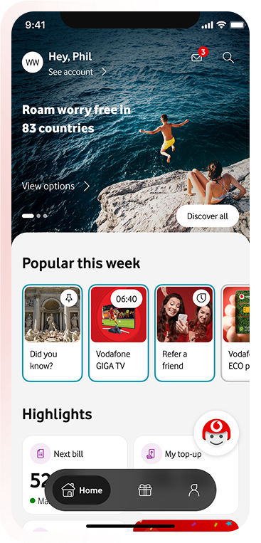
Rebuilding Vodafone’s design system from zero to scale across 20+ products and 14+ markets, creating reusable patterns, clear documentation, and governance that hundreds of designers and developers can rely on.
Design System Architect
Product Designer
Accessibility Advocate
Worked alongside 14+ international product teams and design system engineers.
Figma
Zeroheight
Accessibility tools
WCAG 2.2 AA
Design tokens
Documentation
Design system
At Vodafone, I was part of the core team responsible for rebuilding the design system from zero to address inconsistency, slow handoff, and fragmented patterns across products and markets. I led key system domains, including component architecture, tokens, documentation, governance, and adoption, enabling hundreds of designers and developers to work more consistently and efficiently.
Vodafone’s digital presence spanned a wide range of apps and web interfaces, with multiple teams working in silos. This led to:
The strategic challenge was to establish a single source of truth that supported scale, flexibility, and long‑term evolution without slowing delivery.
I held end‑to‑end ownership of critical design system domains, contributing beyond execution into strategy, governance, and adoption.
As a design system designer, I approached Vodafone’s system as a product in itself, not just a collection of components. My strategy focused on three key pillars:
I constantly balanced global standards with local flexibility, speed with maintainability, and autonomy with guidance, ensuring the system solved real problems for teams rather than existing as an abstract guideline.
While internal analytics were limited, the outcomes were tangible and measurable at scale:
The system moved Vodafone from fragmented, inconsistent design toward a trustworthy, scalable framework that teams could rely on day-to-day.
This project reinforced that design system work is about people as much as pixels:
I learned to make decisions that scale globally, influence diverse teams without authority, and structure systems that solve real problems efficiently, not just look neat on a screen.

3D art by Alzea Arafat