The Rat, the Rewards, and Me
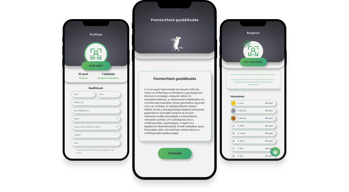
Desktop App
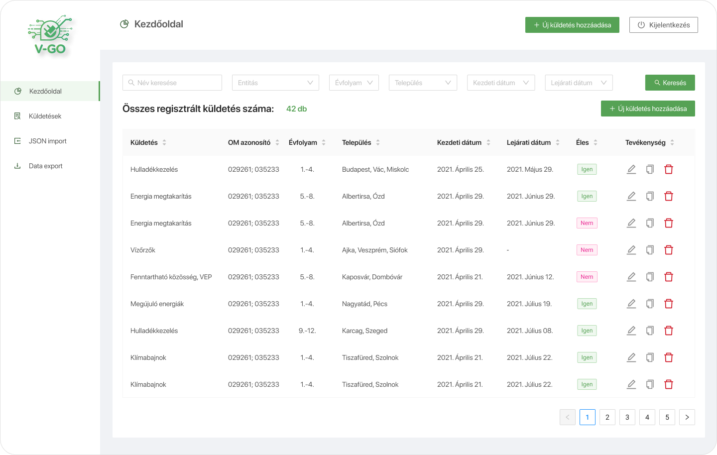
Dashboard
Gamification
End-to-end
🎯 Thousands of Students, Fixed Launch Date → Designed for real scale under hard deadlines
🚀 End-to-End Ownership → Desktop student app + admin dashboard, fully owned
📊 Multi-Campaign Dashboards → Manage campaigns, track participation, questionnaire data & stats
⚡ Reduced Operational Friction → Clear structures so non-technical stakeholders could act fast
🧠 Problem-Solving Under Pressure → Identified gaps, edge cases, and risks early to avoid last-minute chaos
🤝 Front-End Friendly Delivery→ Figma structured for parallel dev in a 2-month design+build window