My very first design system - Don’t judge me

Cybersecurity

B2B SaaS

System thinking

Learn & Grow

🎯 Built from scratch under tight timeline → Delivered a usable system in 1–2 months
🚀 Atomic hierarchy & reusable components → Atoms → molecules → organisms → pages
📊 Hero components solving real UI problems → Multi-layer menu, cookie panel
Developer-ready documentation → Clear Figma guidelines for immediate adoption
🧠 Problem-solving mindset → Balanced learning, production, and client education

ROLE

Design System Architect

TEAM

Worked closely with Balasys’s in-house designer and my development team.

TOOLS

Figma

SCOPE

Atomic design system

Dev handoff & documentation

About the Project

Back in 2021, Balasys needed consistency across landing pages and campaigns, but there was no shared structure to support it. Visual decisions were being made ad hoc, and each new page increased the risk of fragmentation.

The goal wasn’t just to create components, it was to stabilize the product visually while enabling faster delivery.

My Contribution

I designed and structured the design system from the ground up in Figma and worked closely with the internal designer and development team to make it usable in real projects.

Beyond building components, I acted as a translator between intent and implementation: aligning design logic, visual constraints, and developer reality into something that could actually be adopted.

My Approach

I approached this project with one guiding question:
“What’s the smallest amount of structure that still meaningfully improves consistency?”

Because the internal designer was already producing visual designs, I couldn’t redesign everything from first principles. Instead, I focused on strategic intervention.

Where I saw unnecessary variation, I pushed for simplification. Where visuals couldn’t change, I looked for behavioral consistency: aligning spacing, states, and interactions so components still felt cohesive even when they looked different.

The navigation became the most complex problem. It was large, content-heavy, and central to almost every page. Rather than treating it as “just another component,” I treated it as a system inside the system. I mapped its states, depth, and scalability, then designed it so it could grow without becoming unusable.

I was constantly balancing tradeoffs:
- Reusability vs. visual fidelity
- Ideal structure vs. adoption risk
- Teaching vs. shipping

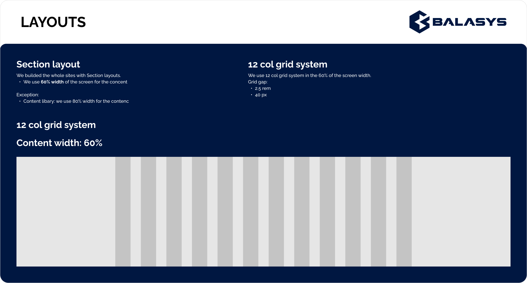
Documentation played a critical role. I used Figma not just to show components, but to explain decisions: why something existed, how it should be used, and where flexibility was intentional versus accidental.

Outcomes

The system held the brand together across multiple landing pages and campaigns and reduced visual drift over time. Developers could reuse components with confidence, which sped up delivery and reduced inconsistencies.

More importantly, the system introduced a shared mental model across design and development, even if the system itself was still evolving.

Reflection

This project belongs in my portfolio because it’s where I learned what design systems really are: not libraries, but decision frameworks.

Balasys taught me how to introduce structure without freezing creativity, how to negotiate constraints without losing integrity, and how to design systems that people actually use, not just admire.

Everything I build today is more refined, but it’s built on the same mindset I developed here.